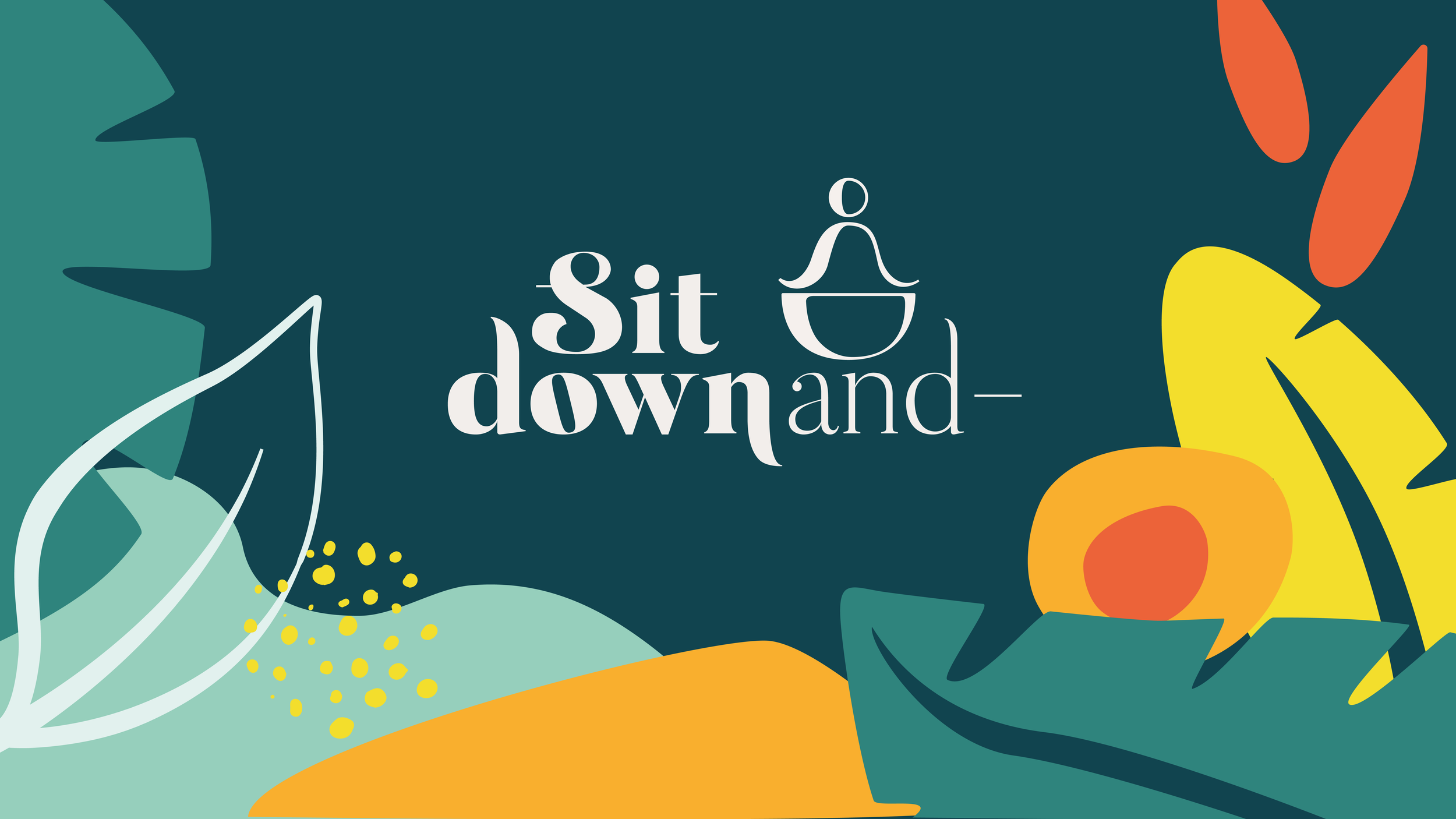
Sit down and - is a platform for people who want to begin or deepen their knowledge of meditation. It includes many resources, a course “Sit Down and Practice”, and a book. They use a simple and straightforward method that brings attention to developing three skills: Focus, Observation and Balance.
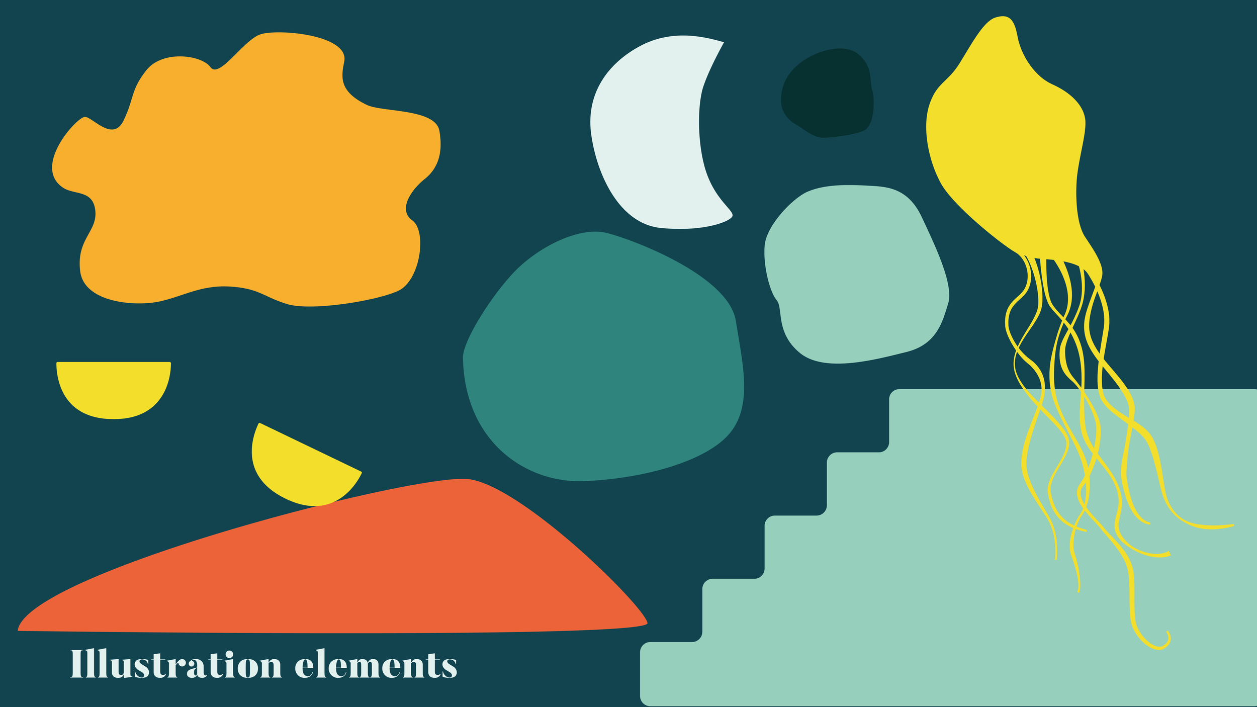
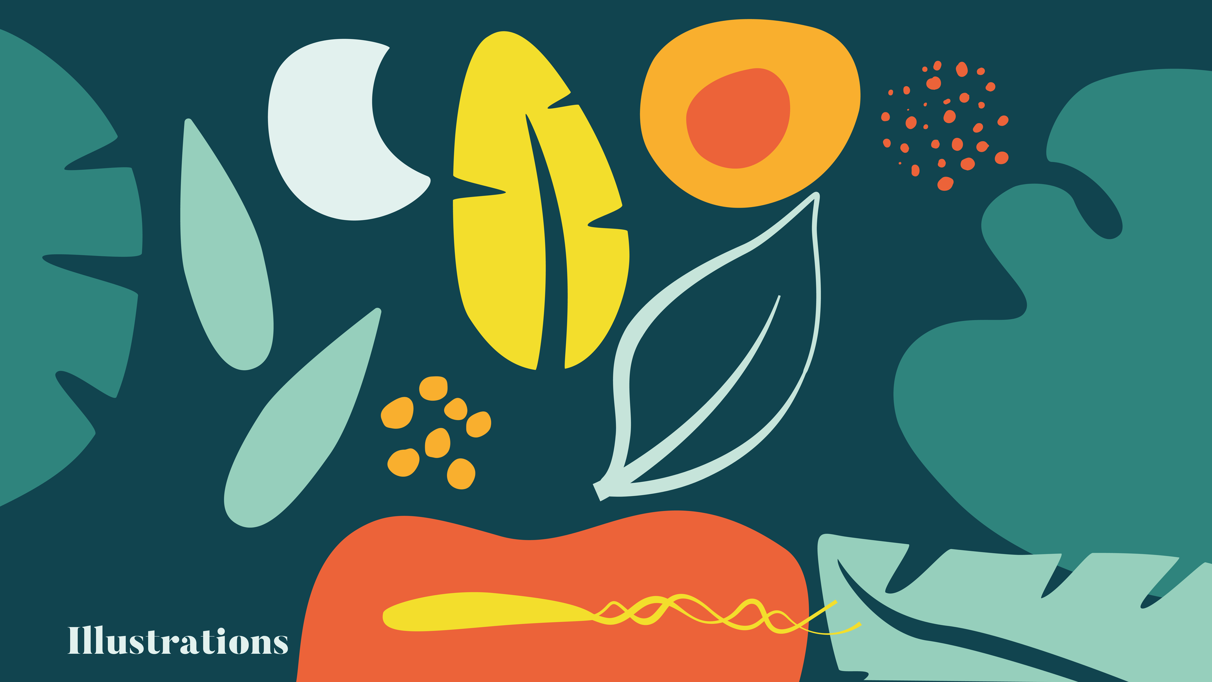
Using the dark background reflects our journey inwards as we dive into the meditation path. The round and colorful shapes add a touch of playfulness to the design, reminding the user that learning these skills requires fun and a curious mindset.
Helping more people deeply experience the benefits of meditation practice.
brand Identity · Design · Illustration
Primary logo variations
The logo is offered in multiple variations to suit a wide range of different placement needs. Both the word mark and the brand mark can be used independently or combined together in either a stacked or linear arrangement, providing flexibility for various design contexts.
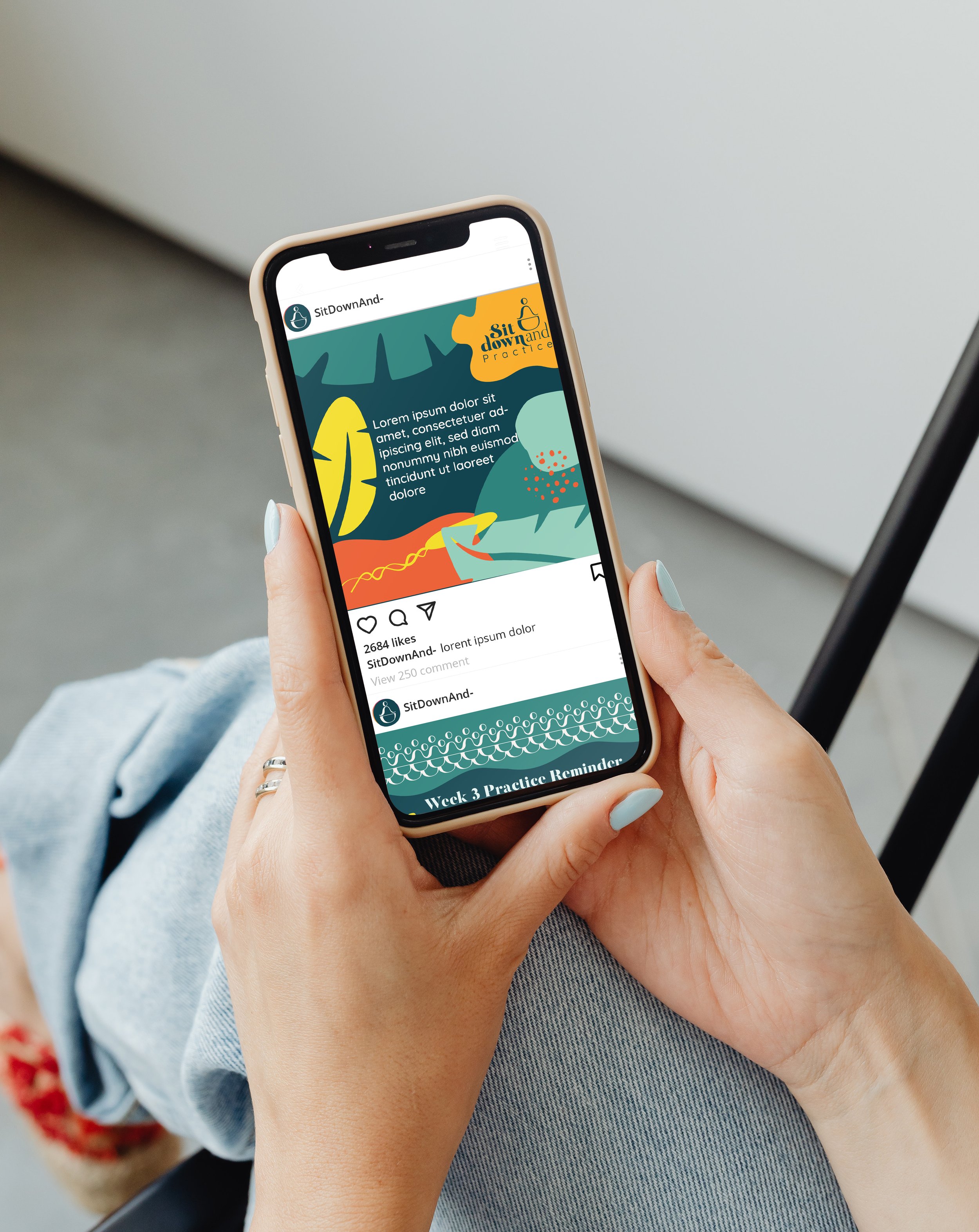
Sit Down and- on social media
Sit Down And- adopts a social media strategy centered around a distinctive and visually consistent illustration style that enhances brand recognizability and uniqueness. Utilizing a specific set of illustration shapes, the brand plays creatively within its established color palette, featuring dark backgrounds that provide a strong contrast to light-colored text. This approach not only ensures visual cohesion across posts but also helps the brand stand out in users’ feeds by creating a memorable and engaging aesthetic. The consistent use of these tailored illustrations reinforces the brand identity, making Sit Down And- instantly identifiable and appealing to its audience.

Colors
The dark color represents our darker side, symbolizing the inner journey we embark on through meditation and self-reflection. In contrast, the brighter colors highlight important information, serving as gentle reminders to have fun, stay engaged, and find joy while learning new skills and deeply enjoying the practice.